Cryptocurrency – Auxilium – Logo
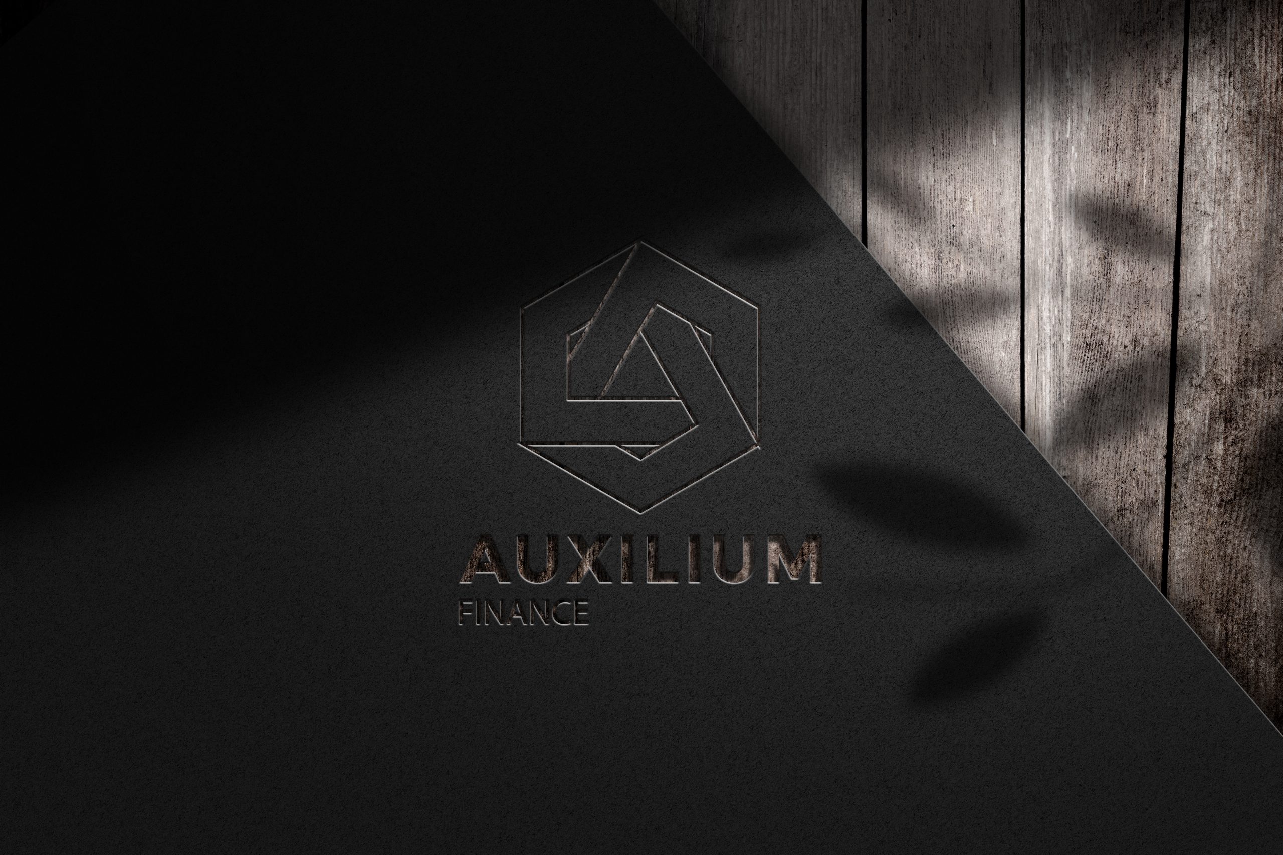
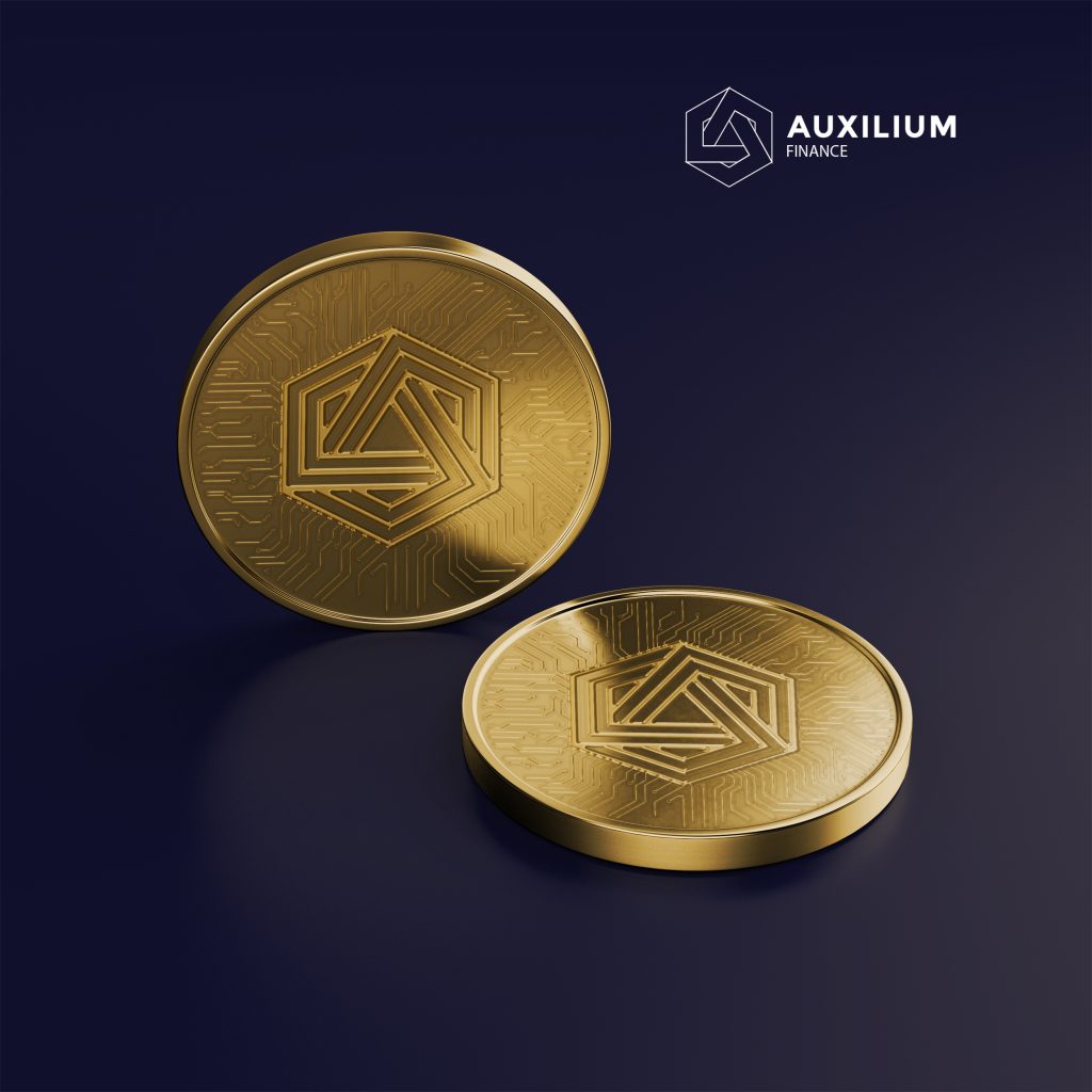
The design of our official logo embodies a contemporary dynamism and elegance that combines key crypto elements with our token name. The focus on the initial letter A and the linear structure had to show the use of the new technologies and represent an infinite shape. The use of the blockchain combines this approach and makes the logo stand out more concisely.
Following AUXILIUM’s premier premium claim, the processing of the figurative mark was primarily characterized by increased value. The design can also be used individually, detached from the AUXILIUM Finance lettering. This self-confident appearance of the trademark stands for a future-oriented sovereignty in dealing with the branding of AUXILIUM Finance.

As part of the alignment of the brand, the corporate typeface was also comprehensively examined for its potential. The Montserrat used by AUXILIUM Finance is characterized by a great blackness and a certain heaviness and thus by its own conciseness. When designing the AUXILIUM Finance typeface, the unmistakable and unusual Montserrat typeface should definitely be retained. It was important to transfer their special properties to a new one that meets today’s requirements, is contemporary and future-proof.

